Monday, June 24, 2024

One Liners by Jessica Spring

Jessica Spring. One Liners. Tacoma, WA: Springtide Press, 2023. Printed by Jessica Spring on Mohawk Superfine in an edition of 150 copies. Tuemouche binding by Gabby Cooksey with Hook Pottery Paper case. 6 x 9.375 inches, 74 pages. US $461.

One Liners, and many other wonderful things, may be purchased at the Springtide Press website. Spring's Instagram handle is @springtidepress

Although I’ve spent a lot of time working with and designing typefaces, I’m not one of those people who’s just crazy for type specimens. I like them well enough but very few of them make me all squishy inside. I think this has to do with the fact that my love of type grew out of my obsession with printing books. The type specimens that I have to have either feature a meaningful textual content and/or display virtuosic feats of printing (think Jen Farrell's The City is My Religion or Charles Derrier's Specimen-Album). All those other specimens—the kinds that show a zillion variations of the same face or just display their types in nonsensical texts—send me daydreaming. They’re fun to look at, but as a book lover they leave me wanting more. I guess this makes me more of a type crank than a type geek.

            Of the type specimens I find least inspiring, none rival the one-liners, those numerical listings of typefaces in which the type on display may as well be widgets in a trade catalog. Sure, this one is heavier, that one slimmer; this one shouts, the other murmurs; but at the end of the day the types just stand there, lined up like bored suburbanites waiting for their trains. When I look through these books, I feel as though I’m suddenly a middle manager whose sole job is to decide what titling type pairs well with Text Type #35. Fancy a swash perhaps? No, I better not….


A page of one-line type specimens from the Schriftguss K.–G. catalogue, Dresden.

It's funny what books reveal about their readers. What kind of nut job feels reduced to a suburban middle manager by a type specimen? Aren’t the minute details that distinguish one type from another—the very details that should matter to someone who loves type—easier to appreciate in one-line specimens? Must everything be a grand spectacle, clanging along with maximum bells and whistles? Well, in answer: 1) my kind of nut job, 2) yes, and 3) why not? If one-line specimens are what’s available, I want one that’s firing on all cylinders. I want it to be literate, geeky, and dazzling all at the same time. And I don’t think that’s too much to ask, even though I know of only one book that fits the bill: Springtide Press’ One Liners.

I became aware of Jessica Spring’s work via the circuitous route of a hashtag: #daredeviltypesetting. A lot of metal type printers on social media tag their posts as “daredevil,” and eventually I followed the trail to its source: Springtide Press’ Daredevil Furniture. I started following Spring’s Instagram feed and, with each post, my retroactive FoMO grew more intense. 


Spring is an aficionada and collector of historic typefaces which she uses with an intelligent, iconoclastic wit. She makes, among other things, precise, postage stamp-sized “seals of approval”; political broadsides; conceptual artists’ books; and self-styled “daredevil” typographic prints. Spring and I began exchanging prints now and then, especially during the COVID-19 pandemic. With each exchange, I felt like I got the better end of the deal. Spring’s prints are more elaborate than the blunt missives that I typically send out. They are also more nuanced. There is an historical intelligence to Spring’s designs—she doesn’t simply revel in the profusion of material available to her (though she undoubtedly does do that), she uses that material in deliberate, meaningful ways. She also seems to have a lot of fun doing it. To describe her work with any kind of accuracy requires a flurry of adjectives; her work is quiet, loud, restrained, brash, clever, timely, historically-minded, and many other things besides. All of these qualities are present in One Liners.


            One Liners is half specimen, half journal. Or, actually, it’s whole specimen, whole journal. It consists of one line of type that Spring set every day between January 1, 2021 and April 6, 2022, with an appendix of monograms and initials that were set later. As Spring writes in the introduction, “…I would set just one daily line measuring 22 picas…. My intent was to capture each day, from the most mundane and personal to events unfolding in the world. There was no lack of content: on day six our nation’s Capital was attacked by a violent mob. The insanity continued with Covid, political protests, environmental catastrophes, and the death of my dear friend Pat.” The opening page of One Liners reads:


A resolution made: set forth & print

When the days run together, it’s Blursday

Sunday Family Zoom

Georgia votes tomorrow!

COVID 19

We win Georgia, but lose the Capitol to terrorist mob

IMPEACH

This is America. This has always been America… Let it move us to action –R. Gay

Seeing friends and family virtually leaves me anxious, lacking

No rain? Let’s walk.

Please, please—stop saying SILVER LINING or ON THE BRIGHT SIDE


            What Spring captures in her one-line journal entries is the different structure of Covid-time, particularly the strange equivalency of events—any events—during the lockdown. Anything that pierced the otherwise plodding sameness of the day, the week, the month is in this book, and, when I read it, I feel as though a little of my humanity is being restored. The constant torrent of the 24-hour-Covid-Police-Brutality-Insurrection news cycle is there. But so are the aspects of life that are ordinarily granted less weight, like a Sunday family zoom call, as well as the loneliness and anxiety that such a call can provoke. By including these “lesser,” personal events alongside the global issues of the day, Spring elevates them to the status that they deserve. It is precisely these quotidian moments that I want to remember. 


As life has gradually returned to “normal,” my experience of time is once again the amorphous wash by which pre-Covid life was recorded. Life has become fast and full again. And the default judgements of an informationally-fatigued populace—baking bread = banal, political scandal = meaningful; or, personal loss < global strife—have returned in their ambivalence-inducing bias toward the sensational. When I sit and read One Liners, as I have done many times, it helps me fend off this diminishment of the personal. In other words, it does exactly the opposite of what I accused one-line specimens of doing a few paragraphs back.


One Liners does all of this while displaying Spring's remarkable collection of metal type. It is enough to make even the crankiest type lover pine with envy. One reality of stewarding such a collection is that the type is both precious and delicate. It needs to be handled with care. This kind of handling has resulted in occasional uneven inking, which is One Liners' single, minor flaw. But as a printer, I would turn that statement upside down: the fact that the printing is as even as it is, considering the light impression used to protect the type, is further evidence of Spring’s talent. 

One Liners is a book that can satisfy all manner of type-crazed bibliophiles. If metal type is your thing, this book has it in spades. If you find solace in Covid memoirs, One Liners has you covered. If you belong to that super-niche fellowship for whom 22 pica lines form the godhead, look no further. Most of all, One Liners achieves what I consider the highest goal of book arts: to make a book in which the textual and graphic content fuse into a greater whole. It is through this elusive alchemy that a one-line type specimen can change the way I look at the world and how I want to live in it.


* All photos courtesy of Jessica Spring, except the one of the Schriftguss specimen which is by Annie Schlechter.

Tuesday, June 11, 2024

The Work & Play of Barbara Henry

Barbara Henry. Th Playbook. Jersey City, NJ: Harsimus Press, 2014. Printed on Zerkall and Hahnemühle papers, bound by the Campbell-Logan Bindery in full cloth. Designed and illustrated by Barbara Henry. 10.75 x 7.25 inches, 64 pp. Edition of 50 copies. US $400.

Barbara Henry. Th Workbook. Jersey City, NJ: Harsimus Press, 2010. Tacket-stitched pamphlet with handmade paper wrapper. Designed and illustrated by Barbara Henry. 10 x 6 inches, 24 pp. Edition of 47 copies. US $100.

Barbara Henry's books are available for purchase at the Harsimus Press website.

In 2010 Barbara Henry published an unusual book called Th Workbook. In it she postulated that the two letters t and h ought to be combined into a single character, either a ligatured th or a Greek theta. From this description, it is easy to imagine that the book would be an odd Esperanto curiosity, aimed at a few perverse aficionados who really, really like ligatures. But, as if anticipating the grumblings of more conservative typophiles, Henry begins her book with a text taken from Legros and Grant’s Typographical Printing-Surfaces of 1916, in which the argument for a combined th (as well as the admittedly less useful ng) is laid out in clearly practical terms: from publisher to advertising buyer, compositor to reader, the proposed ligature would result in an enormous savings of both time and money. Draped in this veil of quasi-practicality, Henry embarks on a lovely, albeit incomplete, exploration of the book’s generative idea. The short texts in the book are paired with ornamental arrangements and linoleum cuts, two of which are multi-color, full-page birds (both thrushes as it turns out, or, if Henry has her way, Θrushes).

Despite its charms, though, there are two elements that are notably missing from Th Workbook. The first is a plausible typographic example of what a page would actually look like in this alternate universe. Theo Rehak cobbled together some Th and th ligatures of Bulmer for the project, but they are anorexic and unconvincing. This is a problem in a book whose engine is typographic change, but it somehow does not diminish the enjoyment of the book. Instead, the main problem with Th Workbook is not its typography but its length—the book ends too soon. It is hard to read it without wanting more.

Enter, Th Playbook. Published in 2014, Th Playbook is announced in the prospectus as a sequel to Th Workbook, and it immediately presents itself as a more substantial book. This is worth noting because, when the two books are viewed side by side, one learns a little something about their maker—Henry takes play more seriously than she does work. Accordingly, the Playbook is cast in a different light from the outset. As she says in the prospectus: “Setting type by hand, letter by letter, invites revery, and this book is the result of following the revery wherever it leads, finding or creating and setting the sorts used for th throughout history, taking an ancient or a new path.” This difference in perspective is echoed in the book’s opening text as well. In contrast to the prattling formulas of Legros and Grant, the Playbook begins with a passage from Jorge Luis Borges’ “Blindness:” “…the Saxons, like the Scandinavians, used two runic letters to signify the two sounds of th, as in thing and the. This conferred an air of mystery to the page…. For that reason…one hears, one sees, each one of the words individually. We think of the beauty, of the power, or simply of the strangeness of them.” These Saxon runes that Borges mentions are introduced into the Playbook, increasing the number of Th variants to four: the ligatured th, the theta (Θ, θ), the thorn (Þ, þ), and the eth (Đ, ð) (though technically the thorn and the eth comprise one variant: the thorn is used for the unvoiced fricative, as in thin; the eth for the voiced, as in the). With her now complete set of alternate characters, Henry sets to play.

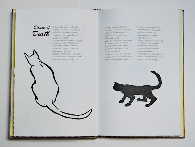
From Borges, we proceed to a stanza of the anonymous 14th century poem, The Pearl, which is set using the thorn and the yogh (ȝ) (another runic form). This is followed by a brief statement of intent, Θe Case for Θ; a setting of Henry’s whimsical poem Dance of Death in three variations, the first using standard typographic usage, the second the thorn and eth, and the third the theta (surprisingly I find the thorn/eth combination the most legible); two four color lino/typographic gravestones demonstrating the use of the antiquated ye (a logotype of The from which is derived the antiquey “Ye olde…”); a three act play titled “ΘE WRAΘ OF ΘOΘ;” and, finally, a slanderous review of said play. Throughout these texts are interspersed a delightful array of typefaces, both metal and wooden; multi-color linocut and ornamental fantasies; and a parade of linoleum-cut cats printed in one or more colors. (Although the cats seem arbitrary, the careful reader will discover the logic behind them. Note: this book benefits from reading.)


As if this weren’t enough, these texts are followed by a section titled Ligatures & Logotypes, in which Henry displays the fruits of her four-year interregnum since the Workbook. During this time, she scoured the type specimens and matrix cases of typefounders to find as many examples of Th ligatures as possible. She also found the actual type, and this section of the book acts as both type specimen and historical interlude. It is set off from the rest of the book by being printed on cream colored laid paper, as opposed to the rest of the book’s white wove, and it is printed in a simple two-color scheme: black ink for type, yellow for the cats. It is not insignificant that this section is the first in which an image of a woman appears, lovingly holding her cat—if there is anything one can be sure of about Barbara Henry it is that she loves type, and handles it as gingerly as she does her cat.

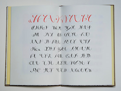
A second image of a woman appears immediately following the Ligatures section; she is bent over, letting her hair down while standing above a stalking feline. There is a dreamy, sun-drenched-morning quality to this image that is abruptly displaced by what I will call the Maths & Sciences section of the Playbook. The semiotic message of this pairing is clear: Happy-Dreamy-Cat-Type-Time is over. We passed through the ancient and medieval source materials, reveled in the typographic era, and now we are headed for the stars and the digital ether. In rapid succession Henry traces the theta’s use in algorithms, Big O Notation, trigonometry, statistics, physics, reliability engineering, astronomy, and the Phi Beta Kappa society. From this velocious spiral of Wikipedia-esque data we are cast, disoriented and bleary-eyed, into the post-typographic mire: a section of asemic writing reproduced from Henry’s copperplate (non)calligraphy.* After a short introduction about asemic, or non-semantic, writing and its digital corollaries, the reader is confronted by four pages of Henry’s sensitive penstrokes, replete with red titling. This quiet finale, in which the very fabric of our written communication is broken into beautiful but, ultimately, illegible gestures, gives the entire project a sudden weight. It turns out that when serious people play, the outcome is not always lighthearted. Henry’s whimsical experiment with alphabetical adaptation has reached its logical conclusion—the replacement of the alphabet with visual nonsense. There are many lessons and morals that an analog bibliophile might draw from this shattering of meaning, but none are so profound as the silent, elegiacal quality of these final spreads. There is nothing to say because the connective thread between meaning and form has been severed. Couched in the odd splendor of Barbara Henry’s book, however, this foray into abstraction is anything but melancholic. It is part of Henry’s revery and, happily for us, she has chosen to share it.

There is so much content in the Th books that reviewing them leaves little room for a discussion of craft. Needless to say, Barbara Henry is an exceptional printer. Each page is beautifully inked, and printed with a light, consistent impression throughout. The paper binding of the Workbook was thankfully superseded by a sturdier case binding on the Playbook, but other than that these books are so uniquely Henry’s that I wouldn’t change a thing. Between the two books I count no fewer than 132 type and linoleum formes. Together they cost $500. In other words, Henry is paying you to take her books from her. Oblige her. Buy them, read them, and enjoy them. But hold onto your cats, it’s a wild ride!