Farrell, Jen. The Almighty Starshaped. Chicago: Starshaped Press, 2019. Printed by Jen Farrell on Mohawk Superfine paper in an edition of 100 copies. 5.25 x 7.25 inches, 48 pages. US $400.
The Almighty Starshaped may be purchased on the Starshaped Press website.
My favorite type specimens* use their ostensible motivation—advertisement—as a smokescreen for their actual purpose: to throw down a challenge to other designers, with as much brio and bravado as possible. Leave the numbers to the bean counters; bragging rights are the true currency of these books, which means they are often thoroughly impractical. They set an aspirational bar that for most designers remains either perpetually out of reach or too prohibitive to consider. For instance, of the thousands of practical, forgettable type specimens produced during the typographic era,** there is only one Manuale Tipografico (even if others use the name), only one Specimens of Chromatic Wood Type, Borders, etc. This is not to say that less daring specimens lack value, but that their value most often derives from their insight into industry. The virtuoso specimen, on the other hand, operates on many levels, some of which are more closely aligned with art than with commerce.
What is interesting about metal type specimens produced in the post-typographic era is that the motivation behind the books has changed. As a consequence, the specimen books of the last fifty years have taken on a decidedly different character than their predecessors. In most cases the type itself is not for sale. Rather, it is the type collection and the ingenuity of the printer that are being advertised. Some of these books are produced as reference works for the press that owns the type, others as celebratory exercises in typography, still others as stalwart claimants to a tradition perceived to be under attack. As in the typographic era, very few recent specimens stray too far from the expected, using familiar texts from the nearly-dry well (I hope!) of interbellum typographic literature, and arranging them in handsomely restrained layouts.
By repeating the standard tropes and texts of earlier specimens, these books hasten, rather than staunch, the demise of the traditions they hope to save. Imagine if Bodoni or Page felt bound by the styles and conventions of the previous century. We wouldn’t even know their names. Which brings up another issue: one of the qualities that makes many of the great specimens great is that they displayed new typefaces produced by the foundry or designer who issued the specimen. This is no longer the case for metal type specimens. In the absence of new types, then, a specimen book that fails to present old types in new ways brings its own existence into question. Why bother?

A good example of work that escapes these pitfalls is that produced by Phil Gallo at his Hermetic Press. Gallo’s work comprises a series of conceptual and textual pieces that, when considered together, form a kind of accidental type specimen. They are set in historical typefaces, but they present familiar things in new ways; they give insight into the time and place in which Gallo works and they provoke us to reconsider our assumptions. Jen Farrell’s book, The Almighty Starshaped, reminds me of Gallo’s work, particularly his masterful Found Poems, in that the meta text of both books is the Printer, capital P, and her/his relationship to the world around them.

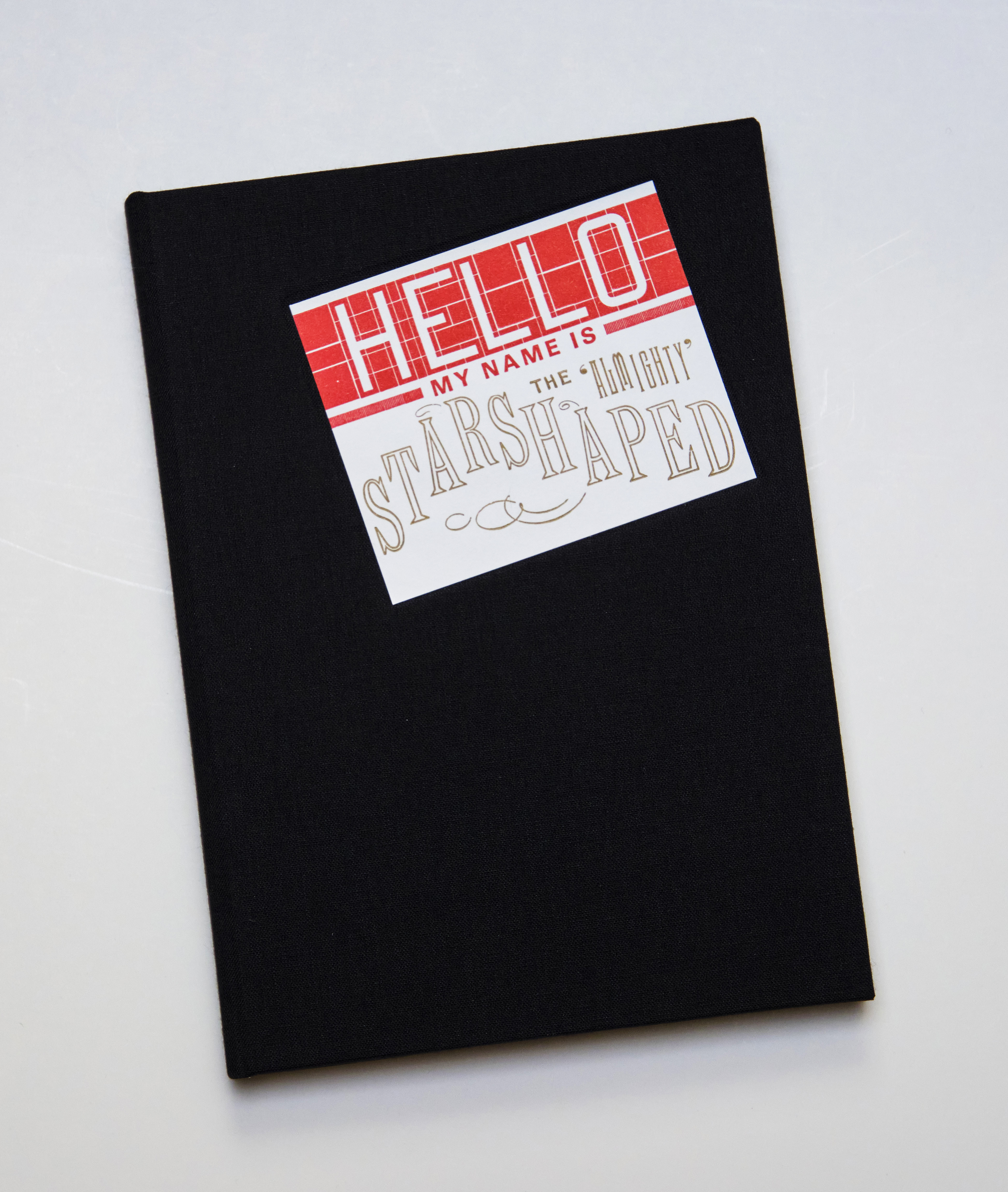
The world around Farrell is the city of Chicago, and The Almighty Starshaped is nothing if
not a tribute to her town. Modeled on the Moleskin-esque piece books kept by
graffiti artists, The Almighty Starshaped
quickly knocks the fine press reader off-kilter. The cover label is a hand-set
“Hello my name is” sticker, similar to those used to tag paint-resistant
surfaces with graffiti. Like many of those quick tags, the cover label is
positioned at an angle, rather than parallel to the top edge of the book. The
endpapers are printed black on gray, set in a brick-wall pattern that is interspersed
with the book’s title in a variety of type styles. This is followed by a faux
ex-libris, a half-title, a brief introduction, and then the first of four fold-out
pages: a robust title page that comes at you with such swagger that it forces
you to reappraise your abilities. Could I
do that? The letters in the word, "shaped," are composed entirely of typographic ornaments that, together, evoke lettering styles seen in contemporary graffiti.


The title page is followed by sixteen one-page specimens printed on the rectos, as well as the three additional fold-outs. Many of the one-page settings are faced by a short setting on their opposing verso, creating a dialogue between the two. For instance, the setting, “Vote Starshaped Press for Mayor Everybody’s Doing It,” is faced by a lovely ornamental vignette stating “Early & Often.” The recto is inspired by the absurd number of candidates in a recent Chicago mayoral election, while the verso ties the recent event to the city’s storied history of political corruption. The Almighty Starshaped is full of these kinds of dialogues, unexpected bridges between old and new, that succeed in making Farrell’s remarkable collection of historic type and ornament feel fresh and relevant today.

Another quality that separates The Almighty Starshaped from many historical type specimens is its text. Even if we don’t consider the gibberish used by wood type manufacturers in their specimens, historical metal type specimens rarely made a textual contribution. Setting a variety of type styles and sizes in the same text—Cicero, perhaps?—allowed viewers to discern minute differences among typefaces. There was no need to make explicit references to the historical moment in which the specimen was produced—that was evident in the type designs themselves. When considering making a metal type specimen today it would be worth taking Farrell’s approach as instructive. Rather than each page representing a discreet design, disconnected form its neighbors, the pages in The Almighty Starshaped work together to create a textual narrative that is greater than the sum of its parts. Each page offers a vignette of life in Chicago that, in the aggregate, give a sense of what it is like to live in the city. This is not just a book of typographic pictures.


So, if brio and bravado are what you want from a specimen, look no further. With The Almighty Starshaped Farrell has earned her bragging rights. At a recent viewing of the book with several seasoned bibliophiles, Farrell had to repeatedly say, “No, it’s hand-set metal type,” as each page was turned. To which the typical response was “But how did you….” trailing off into silence.
When Farrell made The Almighty Starshaped, books were a relatively new form for her. Since then, she has produced what will certainly go down as one of the great specimens of our age, The City is My Religion. For more on that book, see Jill Gage’s insightful review in Parenthesis 41. But having gotten to know Jen a little bit over the years, there is something about The Almighty Starshaped that will always hold a special place on my shelves. It captures Farrell so well: it’s got a punk rock vibe, it throws a subtle finger to the establishment, and it exhibits an enormous, undeniable talent.
* As evidenced in my review of Jessica Spring’s One Liners, my “favorite type specimens” is an evolving category.
** For my purposes, the “typographic era” denotes the period in which new metal type production was a central part of the global printing industry, roughly 1450–1950.
An earlier version of this review first appeared in Parenthesis 37. Photos by Annie Schlechter.
No comments:
Post a Comment